Design Psychology & Examples
Here are some examples that I collected for some rules that I learned from the classic design book by Susan Weinschenk — 100 Things Every Designer Needs to Know About People.

Reading and comprehending are two different things.
- Use simple words and fewer syllables to reach a wider audience.
Example: Fabulous, a habit-forming app divides your challenge into days, and the copywriting here is quite simple and easy to understand.

People process info better in bite-sized chunks.
- “Progressive Disclosure”: Provide only the info people need at the moment.
- Counting clicks isn’t what counts
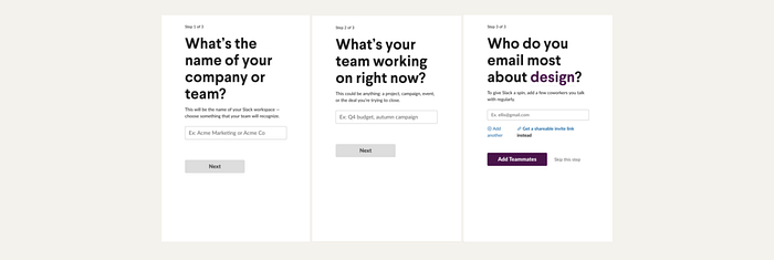
If you have to make a trade-off on clicks v.s. thinking, use more clicks and less thinking. - Break a process into small easy to digest steps. Show progress indicators.
Example: Slack’s onboarding processes have always been light and intuitive. Just enough to get the job done.

People filter info.
- If it’s critical for people to pay attention to certain info, make sure it stands out 10 times more than you think is necessary.
Example: The text-heavy government site made sure what’s important really stood out. Although it’s not visually appealing, it sends the message loud and clear, which is more important.

Sustained attention lasts about 10 min.
- Assume you have at most 7–10 min of someone’s attention.
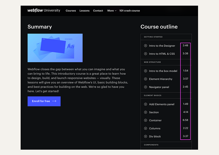
- Keep online tutorial shorter than 7 min.
Example: Webflow’s tutorials are all under 7 minutes. And some are pretty funny too!

People are more motivated as they get closer to the goal.
- The goal-gradient effect: when you are closer to your goal, you accelerate your behavior. Show the progress bar.
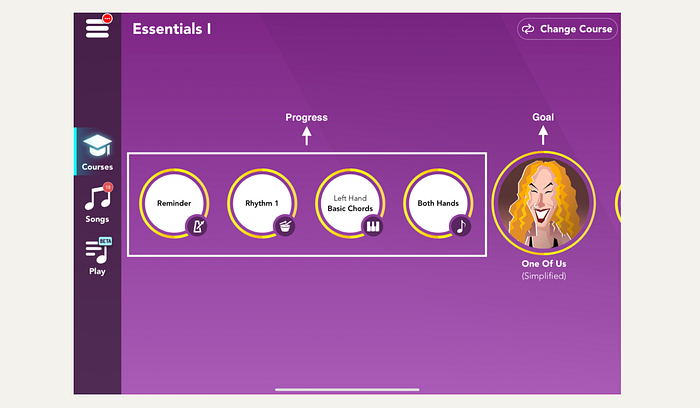
- People are more motivated when the end is in sight.
Example: Simply Piano adds a song practice after a 3–5 “boring” practice, which adds excitement because who doesn’t want to play a song!

People are motivated by progress, mastery, and control.
Example: Fabulous shows you your streak, and success rate on the habit you choose to add to your daily routine.

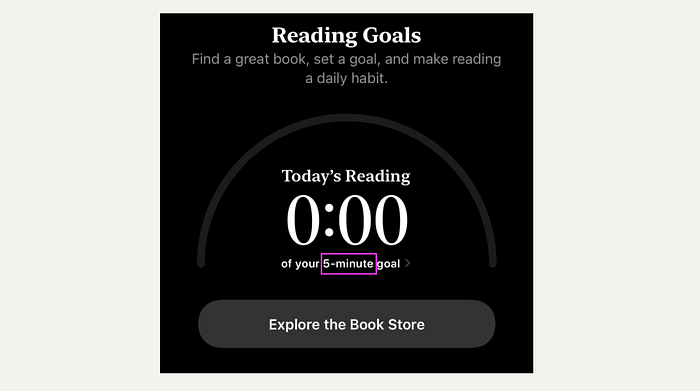
Forming a habit takes a long time and requires small steps.
Example: Books only asks you to read 5 minutes a day!

People are hard-wired for imitation and empathy.
- Show someone else doing the same task can influence people’s behavior.
Example: In Fabulous, you can see people who are doing the same challenges.

Doing things together bonds people together.
- Without physical proximity, online interactions can use audio or video to build synchronous activity.
Example: Clubhouse went viral during the COVID times.

Anecdotes persuade more than data.
- Anecdote → story → empathy → emotional reaction → memory center: so people remember and process your info better.
- Use anecdotes in addition to data.
Example: Charity Water uses both data and individual stories to tell their charity work.

When people are uncertain, they let others decide what to do.
- Reviews and ratings are powerful. Reviews by others “like me” are even more.
- Provide info about the person who left the review, it will be more influential.
Example: We use Google Map’s review to decide which restaurant to go to and what to order.

